
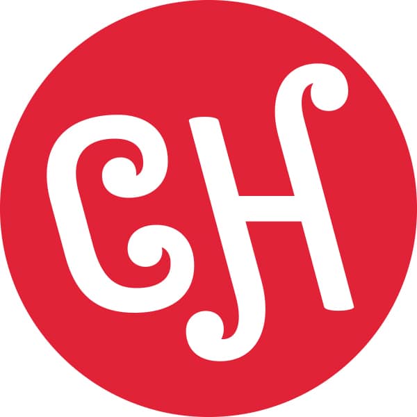
Carnegie Hall’s new logo looks like a…
News1 Cheap hotel chain
2 Coffee store
3 Money exchange
4 Pawnshop
5 Mattress brand

6 Your call….
Wonder what they paid the brand creators.
Wonder why the board approved it.
1 Cheap hotel chain
2 Coffee store
3 Money exchange
4 Pawnshop
5 Mattress brand
6 Your call….
Wonder what they paid the brand creators.
Wonder why the board approved it.
Breaking 180 years of male exclusivity, the Vienna…

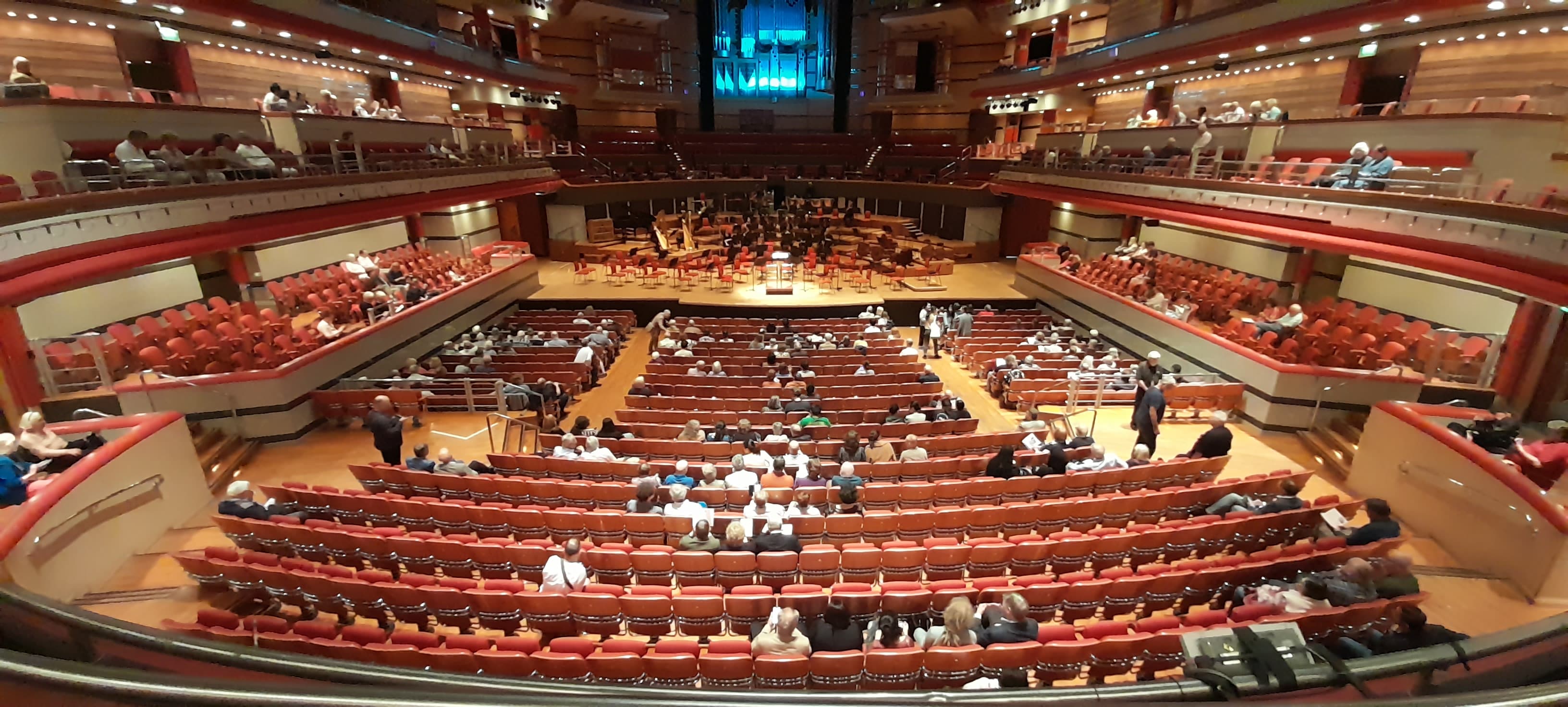
This was the state of the audience a…
The Royal Welsh College of Music and Drama…

There is a rather shocking little survey being…

Session expired
Please log in again. The login page will open in a new tab. After logging in you can close it and return to this page.
I would say simple, “Looks cheap” 😉
You can be sure that one thing that wasn’t cheap was the fee paid to the designers and marketing firm responsible for coming up with this sophomoric “artwork.”
No Class !
A marshmallow logo
Actually a steel logo. The two letters are from a “CARNEGIE” monogram used on girders made a century ago, with the N adjusted to an H.
That explains it, but I still don’t like it.
CH to me stands for Coffee House. A cheap brand type of coffee that is basically Folgers.
Right. Who would approve such hideous a design? I am reminded of a cheap fast food restaurant chain.
Looks like the Chick-fil-A logo!
Perhaps the board of Carnegie Hall found Jesus Christ, accepting them as their savior.
Cheap shot…looks nothing like it save for the colors.
Ketchup or BBQ sauce
Chipotle Hot BBQ sauce
Chicago Hornets football team goes red
Ready-made Swiss cheese fondue
Confooderatio Helvetica
Perhaps it stands for
Chuffing Heck !!!!
Coney Island cheesecake joint ?
We’re lucky Carnegie Hall wasn’t torn down and turned into a cheap hotel 50 years ago! Or-which would have been more likely-an expensive hotel.
An expensive hotel once againgoing cheap…
Hash ciggies
Powered by GE
https://de.wikipedia.org/wiki/General_Electric
The little curls look like part of the “f” holes on string instruments, but I agree that it looks cheap and unimaginative for such a legendary venue.
Reminds me of a Hostess or Little Debbie cupcake from when I was a kid lol
Hey! Whaddaya mean when were a kid? Some of us STILL eat Hostess and Little Debbie! Not to mention TastyKake. Yum!!
Cheap. Amateur. First grade. Nothing classy. Maybe even a grocery store logo. I wonder how many thousands they spent to get this? Ridiculous.
This reminds me of my alma mater, University College Dublin (abbreviated UCD), which treated itself to a presumably expensive – but similarly cheap-looking – new logo several years ago, including a Ryanair-style harp that replaced a rather better-looking and more detailed depiction of a harp.
The logo of this esteemed academic institution now says “UCD Dublin”. So when asked where I spent my undergraduate years, I now feel obliged to reply: “University College Dublin Dublin”.
Diner / All-You-Can-Eat Buffet
Actually, there’s a Carnegie Diner on the corner diagonal from Carnegie Hall. Change the “H” to a “D” and the logo just might be appropriate for it.
For what it’s worth, it calls back to a font found on a beam inside Carnegie Hall. And it doesn’t appear to be the primary logo. https://www.carnegiehall.org/Explore/Articles/2021/06/03/The-Carnegie-Hall-Monogram
Thank you for this context
Seeing this monogram with the primary logo/wordmark makes things worse, in a way, because the two don’t complement each other typographically.
The C&H Sugar brand logo looks much better than this, i.e., far less silly. Isaac Stern must be rolling prestissimo in his grave.
Looks like the sign for a drive-in burger joint….
Must have been a free font.
Just how badly do they want to prove that they are “for the people and of the people” and there is nothing whatsoever elitist or exclusive about this hallowed venue? Yellow arches are coming ,folks. Sad…
Love it or hate it, it’s based on the “font” history of the hall.
Graphic/branding designers will shove any amount of cr*p down your throat to get the job. Having been involved with several re-branding efforts for arts groups in New York City, designers advocate change just for change’s sake with faint regard or understanding of the audiences served.
It’s all about a bizarre desire of an executive director to leave his mark and the designer’s need to make a sale.
Plus, Carnegie probably persuaded some clueless major donor into funding it.
Prawnshop
“Captain Hezbollah”
Reminds me of a cheap engraved initial pendent from Woolworth’s jewelry counter, circa 1960.
Too bad it’s not April the 1st…wasted opportunity.
…Rorschach-test.
“Call Hell or Heaven!”
It depends on the result.
As an American, I like it!
Please return your membership card.
Oh dear…
The last time I was at Carnegie Hall, they’d apparently invited some inner-city children and their families to attend the performance. Someone had forgotten to advise these people of proper concert etiquette and there was chit chatting and laughing the entire concert, sadly mostly egged on by the adults. The ushers were of absolutely no help getting them to stay quiet and advised that I could switch seats if I wanted to, but to a much worse seat. It was particularly frustrating since my friend was performing. I’m all for reaching out to new audiences but this was totally unacceptable and ruined the concert for me. All of this is to say that I’m glad they got this cheap, hideous logo.
Concert hall etiquette has dropped across all demographic groups as near as I can tell. You were lucky. You weren’t sitting next to the same guy I was who was singing along to the Mahler Eighth when the NY Philharmonic last performed it. I was ready to strangle him only to realize that would improve his singing. Ghastly, simply ghastly!
A similar thing happened at the Royal Festival Hall in London some time ago. Someone from management had a discreet word with them at the interval and, as far as I can remember, was widely castigated for doing so. They left.
Not sure I’d use phrase ‘concert etiquette’ though. It’s suggestive of some arcane rule book when in fact we’re just talking about basic good manners. Cinemas often suffer from exactly the same problem. I rarely go.
I had this at the RFH. A man asked my wife to move her
Head because he could not see all the VPO.
I told him to keep quiet or he will be eating hospital food.
I did boxing at school. He quickly moved seats.
I’m very disappointed. Time is overdue to change the name to “Black Lives Matter Hall”
This has nothing to do with Black Lives and everything to do with bad taste.
Caribbean Henna Tattoo Studio
Incredibly ugly!
The color does read “fast food” without context, but the monogram is just based on original 19th Century lettering and appears to draw inspiration from things like the F-stops of stringed instruments, forte symbol, and instrumental and architectural scrolls.
https://www.carnegiehall.org/Explore/Articles/2021/06/03/The-Carnegie-Hall-Monogram
closed-down sexshop on the Reperbahn.
But I feel sorry for the design student who created this.
Looks like a melting CH sticker off the back of a Swiss car, viewed through a bathroom window.
Tasteless, and must have been designed by a well remunerated friend of one of the Board of the Carnegie Hall.
It will fit on a button they can sell in the gift shop. That is all I can see for it.
It is a recurring phenomenon in the PR world… if you don’t know what to do, change the logo.
Chupa Chups
https://en.m.wikipedia.org/wiki/Chupa_Chups
I’ll have two burgers and small fry
Coffee shop. Or donuts & coffee.
Norman, You nailed it — as usual…
7. Contreception vending machines
No violas, not on the finger.
This is actually the new monogram, the logo is dramatically different. The monogram seems to speak of the beginning hope for Carnegie Hall with intent to embrace the present and future. I rather like it, the swirls cleverly conjuring music clefs.
About a person who lived in Carnegie Hall
http://azuremilesrecords.com/overcoming.html
About ushering at Carnegie Hall
http://azuremilesrecords.com/usheringatcarnegiehall.html
About the person credited with saving Carnegie Hall
http://www.azuremilesrecords.com/leonardaltmanmusicrescuer.html
Striking, elegant, memorable, pleasingly linked to the Hall’s origins. By the way, it is the monogram, not the logo; the logo, based on the stained glass lettering above the main entrance, is also quite distinguished.The comments just go to show that musicians (at least the ones that visit this site) are hopeless when it comes to graphic design.
“The comments just go to show that musicians are hopeless when it comes to graphic design.”
No, the design just sucks.
The Chupa Chups logo was designed by Salvador Dali which literally “sucks”.
Q.E.D.
Reminds me of Charles McGraw’s assessment of Marie Windsor in “The Narrow Margin.” “She’s a 60-cent special. Cheap, flashy, and strictly poison under the gravy.”
It implies other letters too – maybe “C J Heffernan’s ” … a chain of ice cream parlors?
It will transform Carnegie Hall into a daring nexus of creativity and innovation.
I queried a few friends when the new design was revealed:
What do you think of the new Carnegie Logo?
“indifferent tending toward dislike”
“cheesy, not classy. Fast Food Burger!”
“in a word, unfortunate. Too cute, too busy, almost childish”
“Not much”
“It looks like somebody’s kid did it”
“Not much”
“Dislike. Rather intensely.”
“I think it’s ugly.”
“ugh! too ‘woosey’ (but I do get it)”
“Barf”
“Yuck!”
“what was their inspiration, Willy Wonka & The Chocolate Factory?”
“Cheese Hut”
“why does it remind me of an ice cream brand logo? Same color as Dairy Queen?”
“CH is the international abbreviation for Switzerland. What was wrong with the big red ‘C’?”
“Ugly”
“Horrible”
Much better than the huge red “C” they had plastered all over everything.
What a masterpiece!!!!!!!!
Henry Cooper’s boxer shorts:
https://i.pinimg.com/originals/65/6f/86/656f860b10874dbe9dda02298f7ad3ac.jpg
A child’s chocolate bar, perhaps a variant of a Curly Wurly!
Correction. This is their monogram. Not their logo (which is also new, and handsome imho).
Toy company, makers of fun and exciting things to do with your friends!
Ugly, characterless and cheap! Did they actually pay someone to design this? A child would have done better!
Sugared cornflakes
Sorry ! I thought it was a child. Could do better next time!
Which aisle can I find this in at Walmart, please.
Cynthia Hart, local hairdresser
It’s beautiful – and its origin story is lovely – it’s based on a gorgeous bit of Victorian vernacular – the embossed wording on the steel girders from with the 1890 building was made (inicidentally, it’s not the logo – it’s a monogram designed for more specific uses than the logo, which represents the full name, as you’d expect).
And how many patrons and potential patrons do you believe are aware of the Victorian vernacular reference? Almost none I expect! And surely the whole point of a logo/monogram is that it is or should very quickly become instantly recognizable. This artwork is childish and unworthy of the venue. Would the CEO care to tell us how much the hall paid for it?
Just another arts executive trying to fix something that wasn’t broken, or tired. Gelb changed the MET’s fonts at one point for $400k. Another abject waste of money.
Maybe CH is just jealous of . . . https://www.youtube.com/watch?v=CCFTo1kBqxw
Switzerland paid for it.. ?
Hourly rates!
….Looks the world we are all in!!
A good logo should be simple, modern, and stylish, but adding a touch of originality can make it truly exceptional. Incorporating gradient vector elements is a great way to achieve this. As a designer, I frequently use this technique to create logos that are both unique and visually striking. The result is a logo that stands out from the crowd and effectively captures the brand’s identity.