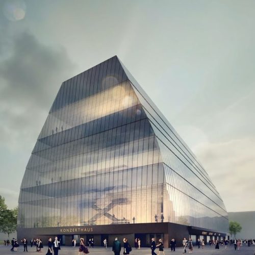
Mariss gets to see shape of Munich’s new hall
mainIts opening, says Jansons, ‘will be the best day of my life.’

Its opening, says Jansons, ‘will be the best day of my life.’

A social media activist has circulated a video…

The orchestra of Spain’s poorest region has just…
The Vienna State Opera has posted a death…
We’re hearing that cello professor Melissa Kraut has…
Session expired
Please log in again. The login page will open in a new tab. After logging in you can close it and return to this page.
My opinion: the model has the typical Bauhaus ugliness. It may have a perfect inside acoustically and all. The outside looks like a huge coffin or corn silo.
You’re not the only one. It didn’t take long for the Konzerthaus to gain some “nicknames”, when the design choice was announced in 2017….”Glasscheune” (glass barn), “transparenter Klangspeicher” (transparent sound-storehouse), “Seehofers Gewächshaus” ([now former Minister President of Bavaria] Seehofer’s greenhouse) and “Schneewittchensarg” (Snow White-Coffin).
It’s nearly as ugly as Berlin’s Philharmonie!
This crazy video will be a revealing specimen for future anthropologists, in the way that fossiles tell paleontologists about curious life forms in the past. The design demonstrates the utmost lack of any invention or aesthetics: it is a building without any aesthetics at all, minimalist functionalism at its most bare, a soulless monstrum showing the emptiness of the undertaking. What is the ‘message’ of the building? Contempt, emptiness, nihilism, and a nostalgia for the future of 50 years ago when ‘looking forward’ appeared the only direction where Germans could dare to look at all. The country’s neurosis is laid bare in embarrassing clarity. But nobody seems to notice.
The bariton Christian Gerhaher talks about ‘the greatest possible seriousness, honesty and appeal’, the violinist A.S. Mutter hopes that audience members will experience ‘sitting in the middle of the sound’ and on ‘Mutter’s lap with the violin at their ear’, the singer Diana Damrau hopes for ‘beauty, respect for beauty’. But the design represents the absolute opposite of beauty, respect etc. (respect for classical music? definitely not). Also, for any orchestral sound it is necessary for audiences to be in front of it, not in the mdidle of it because on that location, all balance – and thus, comprehensibility of the music – is lost (that is one of the reasons there exists something like a conductor). When the architect explains that he wants the audience feel sitting in the middle of an instrument, he merely shows his lack of understanding of what orchestral practice is.
Also truly bizarre is the accompanying sweet, romantic music under images of devastating modernism, with the beginning of Strauss’ utterly pompous Alpensymphonie underlining the most embarrassing empty images, creating the greatest contrast between the messages of shown image and sound. Who would be buying such marketing? At the end, we are told that it is hoped that the shyness about the idea of a ‘music temple’ will disappear, in other words: the building is seen as a welcoming, inviting space for classical music. Did nobody really look at the design? Unintentionally, Jansons’ fragile recommendations symbolize all too well the real nature of the enterprise.
Brilliant, John. Couldn’t agree more.
I noticed that all of the models in the picture were white.
“I noticed that all of the models in the picture were white.”
Even worse, Austrians! 😀
And what would you have done instead? In submitting your reply, remember this is Munich, not Baltimore or Birmingham.
I don’t think you understood the spirit in which Bone’s post was offered, Mr. Bird.
Considering the tenor of most previous comments by Bone (or “Steve P”, as he was formerly known) and the fact that for a time he signed some of his comments with ‘MAGA’, I think it is safe to assume that he wasn’t complaining about the colour of the models.
Looks like an old lunch box.
https://www.dreamstime.com/stock-photo-old-lunch-box-image8716800
Teasingly, I wonder what Irina (seond wife) and Ilona (daughter think of that).
I agree that it is an unpleasantly charcterless building that reminds me of some of the agricultural exhibition halls near where I live.
It reminds me of ice sculpture. Regardless, I prefer an ugly building with first class acoustics over the opposite. Yet some buildings have it both ways. This includes both old ones like the Musikverein and the Concertgebouw, or new ones like the Meyerson Center in Dallas.
I thought it was one of the airship hangars at Cardington.
https://www.bbc.co.uk/news/uk-england-beds-bucks-herts-46211384
I like it. I wish it was a full pyramid with a pointy top though. That would be uber-cool!
Pyramids were built to house a bejewelled corpse. And their design was a first, difficult attempt at geometry. Like the glass pyramid at the Louvre, this form is the greatest test of an architect’s imagination and invention.
This clip paid by the Bavarian State Government. I am for state subsidy of the arts, but why spend tax payer money on this advertising nonsense?
In relation to the cost and prestige of its subject, I cannot recall a worse advertisement for anything. Why anyone thought it worth paying for this crashingly boring commendation of an architecturally utterly boring building I completely fail to understand. I cannot even understand what audience it could be aimed at!
No surprise, here. Much as I love many things about Germany and its people, they are pathologically terrified and mistrustful of beauty. No end of ‘talking a good game’ with societal and conceptual testimonies underlaid with persuasive-heroic music can mask the fact the building is ugly as hell and joins an ever-increasing countrywide landscape of architectural missed opportunities.
This design is actually quite brilliant and very well thought out. The edifice references the iconic shape of Low German large houses from a pre-Renaissance Germanic
culture. This shape is ingrained in the German psyche
and defines a certain aesthetic which is specifically in the culture and which seriously pre-dates the troubled
history of that immense German-speaking swath of Europe from the Franco-Prussian War through the two world wars.
The extraordinary weight which this structure projects,
is well-stated for the musical and other artistic activities manifested within which long have been the great and renowned output of a most creative people.
Very funny spoof.
Upside-down coffins don’t actually represent something ‘German’, but something Western. And the contribution of nazi industrial and military architecture to postwar modernism should not be forgotten.
Looks brilliant. To all the Beckmessers below, definitely stay away.
Actually, if the script of Meistersinger is read carefully, it will be obvious that a Schneewitchensarg would be just the thing Beckmesser would have loved.