
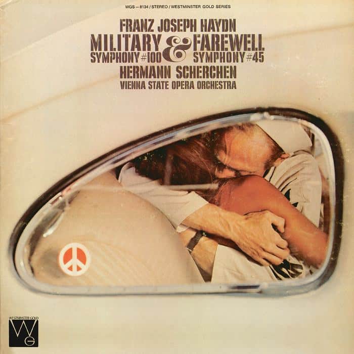
Surely the most obtuse record cover of all time
Daily Comfort ZoneThis is one of those Westminster covers that puzzled even the most devoted fans.
It’s a pair of Haydn symphonies performed by the Vienna Philharmonic under an assumed name with a respected conductor of little renown beyond central Europe.
The image seems to show a soldier embracing his loved one.

In the bottom corner is a ban-the-bomb symbol.
What has any of this got to do with Haydn?
The performance was first released in 1958.
I’d love to know who took the photo and where.


Is it really so puzzling?
It just looks as if someone thought the best way of portraying the idea of “military” and “farewell” was to have a soldier embracing his partner goodbye. The mirror looks like a cars wing mirror which suggests one of them is leaving.
I’ll admit the CND logo eludes me!
exactly!
(I’d think the “wing mirror” is in fact a rear car window.)
it has been suggested (by Harnoncourt?) that the Military symphony has more of an anti-war message – hence perhaps the CND symbol?
Yes, they’re in the back seat of a VW Beetle.
Obtuse? I don’t think so. Just another great Westminster Gold cover c. 1970.
First that’s clearly a sailor (U.S. Navy), not a soldier, saying good-bye to his girlfriend or wife in the back seat of a VW. That gives you both Military and Farewell. The peace or ban-the-bomb symbol is just another ironic commentary typical of this series. You could take it that the couple mean more to each other than politics, that he really doesn’t want to go back, or that the previous owner was a peacenik and the decal was never removed. Your choice.
I had this LP and recall that the last movement of #45 had the various members of the orchestra saying “Auf wiedersehen” as they shuffled off stage. Cute once, annoying on repetition.
These Westminster covers started appearing in the early 70’s. This one clearly is a commentary on the exit of the U.S military from Viet Nam, hence the peace symbol. The image shows it in the rear view mirror of an automobile, suggesting that we should either put the war behind us or own up to the tragedy of the military intervention and the potential loss or farewell so many had to endure. Pretty bold for a classical recording label.
Dear Leonard, Any idea who the sleeve designer was. He/she deserves a credit somewhere – and if not on slippedisc.com, where?
best, Norman
Most were done by Christopher Whorf, who was a leading cover designer for artists including John Lennon.
Right. According to Discogs, art direction by Peter Whorf, design by Keith Longino, and photo by Fred Poore.
I still remember the Westminster Gold Ring Cycle covers. Volkswagen hubcaps as breastplates, cookies crumbling for Gotterdammerung. Among the best in the series.
Except that is the shape of the rear window of a VW Bug of that era. And not the shape of either a rear view or side view mirror of that era; those were rectangular or oblong. Also, neither could reflect this image unless they were removed from the car. Wrong angle.
“Obtuse”, I don’t know about that. “Cheeky”?
speaking of Haydn Symphony CD covers – one of my favourites:
“Hen hunts Queen”
(or symphonies 83, 73, 85)
https://www.discogs.com/release/5583487-Joseph-Haydn-Polnische-Kammerphilharmonie-Wojciech-Rajski-Huhn-Jagd-K%C3%B6nigin-3-Sinfonien-von-Joseph-
Scherchen was of little renown outside Central Europe? Are you kidding? One if the reasons Westminster recorded so much with him was he was a big seller in the U.S. with a fervent following. I was at a sold outAvery Fisher Hall when he conducted Messiah and it wasn’t because it was yet another Messiah. It was to finally see Scherchen who at that point had two Messiahs in U.S. record cataloged.
On top.of that you could not walk into the home of any conducting student without finding Scherchen’s Handbook On Conducting which I believe has never been out of print.
It’s Haydn’s military and farewell symphonies, and the cover is a military man bidding farewell.
It’s as literal as could be, i.e. the opposite of obtuse. You missed the joke.
From the Wikipedia article on Westminster records:
Beginning in 1970, ABC’s “Westminster Gold” reissues, including a new “Best Of” composers series, sported new eye-catching sleeve designs that used whimsy and humor
https://justacarguy.blogspot.com/2020/02/diving-back-into-incredible-album-art.html?m=1
Well, Haydn crafted portions of the 3rd movement of the symphony to wake up the snoozers in the audience. Perhaps that cover went along with that thought.
“Make Love Not War”
Obviously.
But today, we’d read it quite differently:
– Did Navy boy here get the explicit affirmative verbal consent of the woman?
– Is he suffering from PTSD and lack of access to proper psychiatric care?
– Is the car electric?
those Westminster dudes must have been on drugs. Bonkers covers.
This Philips’ Carmina Burana cover is much worse:https://www.classicfm.com/discover-music/latest/worst-classical-album-covers-ever/carmina-burana/
There’s nothing unusual about it all. It’s a WW2 sailor making out with a naked blonde hippie peacenik in the back seat of a 1940s coupe. She’s clearly been transported backwards in time and affixed a peace symbol to the window (few North Americans have ever heard of the CND). Lucky fellow.
I like it. And I doubt a modern man will be trying to reconstruct the spirit of the XVIII century Austria in his head when listening to Haydn’s symphonies.
Off note, though, a CD format easily fits 3 Haydn’s symphonies, so placing just 2 seems a bit of rip-off to me.
I do like it
The older equivalent at a record label of letting the kids be in charge of the social media account?
Maybe it’s a “you had to be there” situation but at the risk of putting my own spin on record industry history, the Westminster label released a lot of very interesting stuff in the 1950s and 1960s, with their own roster of distinguished artists, including the much-recorded Scherchen by the way. Album covers were entirely traditional/bland.
But Westminster was somehow never quite first tier in terms of getting record shop shelf space. By the late 1960s new releases from Westminster were getting so few and far between that even fewer shops carried their catalog at all. I remember actually being surprised to see a new (!)) release from Westminster, one that I wanted very much, that being violinist Robert Gerle and Regis Benoit in a program of music by Bartók, Dohnányi and Kodály for violin and piano.
Just about that time, R Peter Munves was making waves in the classical end of the record biz by reissuing, often with changes to the original couplings and program, the back classical catalog, including reaching rather deep into the vaults for long unavailable collector’s items. He’d mix monaural (even late model 78s) and stereo on the same budget LP and nobody seemed to care or notice. By that time “stereo” was taken for granted, with the consequence that front jackets stopped making such a big deal about it. A tiny asterisk would disclose the mono items to make the law department happy.
Some of the concepts for those reissue lines from Columbia and RCA Victor could be goofy but Munves, whose knowledge of back catalogs was comprehensive, was squeezing lots of new money out of recordings long since “paid for.” The covers were usually a sort of pop art or op art as were many of the pop and rock album covers back then. And suddenly the classical wing was showing real cash flow, which never hurts in the eyes of the executive suite.
That was the context for Westminster deciding to mine their own back catalog Munves style with new and eye catching album covers that most decidedly did NOT look like the RCA Victor and Columbia reissue lines. That combined with a new and lower price, suddenly put Westminster Gold back on the record store shelves with a vengeance. It was a pretty good time to be a serious record collector if you were on a budget.
Some of us haunted the bins that held the latest RCA Victrola, Columbia Odyssey and Seraphim releases in those days and added Westminster Gold to the list, once they began to appear. RCA Red Seal and Columbia Masterworks issues were generally out of our price range and DG and Philips (both of which cost an additional $1) even more so.
I think you mean ‘obscure’, rather than ‘obtuse’. The former refers to the thing that’s difficult to understand, the latter to the failure of the person trying (or not much trying) to understand.
The orchestra is not exactly WPO, Scherchen recorded a lot of symphonies, some even twice for the label. The end of 45 the is extremely touching with musician saying ” auf wiedersehen” and you can hear the wooden floor creak. A sense of eternity.