

The changes we are making at Slipped Disc
mainWe’ve had a quiet rollout of the new website this week and are generally gratified with the readership’s response.
Some obviously take a negative view to any kind of change but we’re making improvements all the time.
Among the key new features you may have noticed a pop-up invitation to subscribe.
This will grant certain privileges, including a daily summary of our posts and special offers from commercial partners.
We have managed to keep the site free to readers and hope we can continue to do so. Unlike other music sites, we do not hide behind a paywall and we aim to keep it that way. Our new subscription revenue will enable us to employ more staff and improve the product.
Other changes have upgraded the visuals and the search facility and made room for some additional features that we will introduce soon.
Our investment in the site is a token of faith in the needs of our readers and of our belief that classical music is of interest to a much broader public than ever sets foot in a concert hall or opera house. Two million readers a month on Slipped Disc tell us that the music business has a long way to go before it reaches the bulk of its core market. Advertise on Slipped Disc (email to db@oko.uk, and you may be surprised by the uptake.


Hope you don’t dismiss this as mere “opposition to change”: Your sentence fragments atop the photos (rather than whole graf summaries previously) are much less user-friendly, and putting the heds at the bottom of it all is just odd IMHO.
That right, just dismiss any negative comments as “Some obviously take a negative view to any kind of change…”. Nice way to categorize your readership.
Successful presenters generally listen to their audience and don’t mock them.
The Chief Diversity Officer at SD will surely employ more appropriate candidates to properly reflect more diverse viewpoints and lived experiences woefully needed from within.
I take a negative view to any kind of change.
But I know it is not the new website that brings about change. People bring about change.
So, with the experience I have with the SD community, … I take comfort in the certainty that no change is to be expected.
There will always be change, even I get older every day, but not sure about the text above and below which picture and which article, I am confused, but this is my first time working with the new format, maybe with time ( my days are numbered don’t forget) it will be easier to figure out.
More… Is it 2 million readers or is it read 2 million times by an unknown number of readers?
I echo Carl. Each story is closer to the header for the next story, which is confusing. And why the big gap between the story and its actual headline? Good luck.
It’s because some headlines are shorter than others, and the way the site is currently constructed, the size of the headline text doesn’t change to “fit” the space. So the design includes a big area to accommodate showing a long headline, even though most of the headlines take up only a fraction of what’s been allocated.
This could be rectified with additional custom programming; not sure it will happen, however.
When I worked for a certain prestigious newspaper, headlines were to be no more than 10 words — no exception. Of course in those days people had to be extremely talented to get any job on a paper…
Echoing others : new layout makes it very unclear and confusing how title and picture relate. It also feels like we’re getting less information at a glance.
The new layout is very confusing to the eye.
The photos do not correspond to their headlines, the numerous adverts are placed willy-nilly throughout each post, badly breaking the continuity, and the typeface used for the text is less readable.
And why is there so much blank space around everything?
I suppose the changes were done to suit readers with mobile devices (I’m reading this on a laptop computer with a 17 in. screen).
I don’t mind change, but a change for the better would have been…. better.
Adblock Plus is your friend. I come here using a laptop too, and don’t see any ads.
re: mobile devices
Not so much difference …
On my device, there are two main, quite similar, problems:
– less information visible at a glance:
Just a few words of the story visible where one could read at least a complete sentence previously.
– difficulty to associate headline with corresponding article:
Thick black horizontal lines appear to separate items, but in fact don’t. Confusingly, there is such a line between headline and its corresponding picture, thus seemingly connecting the previous picture with the following headline.
I’m sure the editor will take his readers’ thoughts into consideration and hopefully sort out these teething problems.
I have no issue with change when it improves things. But I have to agree that the placement of the thick black line remains confusing, even after reading the site for a few days. It implies an ending. So one automatically assumes the headline refers to the article above it. It makes no sense (sorry!) for it to be placed under a title. Indeed, is there any need at all for any line to be under the title?
Why not “box-in” the title of the article along with the picture, into a rectangle? A format such as this would be less confusing.
As one ad man I once knew said, you “box in for stand out” – at least that is what I assume is being attempted here
No complaints about making changes, but like others are saying, it’s the spacing that’s bad. The captions need to be below their photo. That’s the only way it’s going to be obvious what belongs with what.
Since this layout makes the top of the titles flush (across a web page), the varying length of the titles, compounded with still too much damned space between that and the picture, makes visual identification a nightmare. The eye still wants to “attach” the photo to the title below it.
I shall “assume” this design is yet another instance of a perfectly good website dumbing down its layout for use on the smallest common denominator mobile devices. As despicable as that is, I know we can’t fight this trend. Regardless, the complaint about the titles/photos relationship is valid and still stands.
Sorry, Norman but it’s very confusing and difficult to follow. At first, I thought something was wrong w/ my computer.
I agree with everything said above. The layout is confusing , and does absolutely nothing to make me want to bother either reading individual items or the blog ( if that’s what it still is ) as a whole. Did this not occur to anyone at all who was concerned with making these changes ?
I’m all for change – but it’s hard to read with the layout. Even now I keep thinking the headlines refer to different photos. The white space gaps don’t help. Please do think of tweaking the appearance a bit.
Very confusing of headers over stories. The passing of Lady Valerie has — right under it — the header “The Death of a British Composer, 82” The headers for Lady Valerie and two other stories are way above the pictures and don’t look like they’re a part of those stories. There really are some oddly confusing design issues with this new iteration of your blog. I trust that with time we’ll all figure out that the ‘wrong’ headers are the ‘right’ headers and we’ll all move along. But at this stage of development on the internet, the appearance is clunky and confusing. I’d hope you’d accept comments as constructive and not be so defensive.
I echo the comments above – I appreciate the desire for improvements, and monetising the website is a perfectly sensible step. The layout of the text, however, is significantly crammed. It’s inconvenient on my computer; it’s near unusable on my tablet. I’m hoping adjustments can be made.
“monetising the website is a perfectly sensible step” couldn’t possibly disagree more
On second thought, it’s like a regie theatre production-dazzling changes, full of profound intent but ultimately obfuscating what it is trying to clarify.
Update: the layout seems to have improved since my 1st comment, and is now much better on tablet (the text is full-width, which is good). So again, I appreciate the responsiveness and improvements.
Where are the links to previous pages across the bottom? None of the changes is for the better that I can see.
Add my voice to the chorus saying the new layout is confusing to the eye. It’s fine as long as you are at the very top of the page, but once you scroll down a ways, it starts to look like the titles belong with the pictures below them since they are closer (and because the actual headline becomes lost in the clouds). So we get a picture of the Soltis above a headline mourning the death of a British composer, and then a picture of Richard Stokes with a headline about Beethoven. And so on.
Is there a way to move that big white space below the photo instead of above it, so the words and pictures that belong together actually look like they belong together?
This has been a terrific resource, and going through the Beethoven-covid year with the review of his work was one of the most memorable features thereof. During this period I have tried to support many different venues—journalistic, artistic, civic— and I am glad to offer a contribution to the site. I hope it takes contributions even if it is short of the (requested) annual subscription fee. Thanks.
thank you, David.
I like the clean modern look but, as others have already commented, the relative sizes and spacing of header, picture and story text makes it seem to link to the heading below rather than above which is against instinct.
I can see you are reserving space in the header for longer titles but maybe reducing the font size a little as well as the spacing between it and the next section would help link them more logically together. Have you thought of bottom-aligning the headings?
I’m all for white space and readable font sizes in design but on a small screen finding the content among the empty space needs a LOT of scrolling around!
thanks…. we’re working on it.
“The only thing constant is change” – Schopenhauer.
Hi, have been a big SD fan for a long time but – SORRY – you’ve really broken the site. Total confusion with the alignment and spaces. Very frustrating . Am sure it wouldn’t take much effort to fix. Thanks
The new look is not unattractive, however, the placement of the headlines is awkward.
They crowd the top edge of their apportioned white space and thus appear to be captions for the picture above them rather than headlines for the story below.
Surely it must be possible to style the page so that they sit at the bottom of the white space, more clearly attached to their stories illustration.
I don’t mind improvements if they actually work. This new website was not adequately tested for what should have been obvious usability issues on some platforms and widely-used operating systems. The U.S. expression is “not ready for prime time.” If you do not address these problems then you might well see declines in audience size and other engagement indicators.
“We” need our eyes tested.
Myopic – you say we need our eyes tested. A drive to Barnard Castle will do the trick!
There is no confusion when using the mobile version; the mobile version looks pretty fine to me.
Indeed, the tablet version has improved a lot since the beginning of the week – now it looks fine to me.
Thanks for letting us know.
I just have to echo all the others here: the new layout is very confusing. There is a bold line, which gives a nice separation between the articles, but the associated heading is above this line, with blank lines in between. The photo of the previous article, in turn, is visually so close to this headline that one inevitably thinks it belongs together.
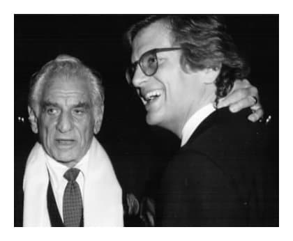
I have to say I do love the picture of Paul Simon – and then underneath it says “Czech soprano, 93”. Quite simply, I find that very original and don’t know what everyone is complaining about.
Good luck with the new site. Changes have to be made every few years, it’s the times we’re living in. God forbid something might stay the same for a longer period of time. Where would that get us? Rebranding is key to expanding, and to generating a further two million readers (or is that clicks?).
If I might make a suggestion, though, I do think “THE #1 CLASSICAL MUSIC NEWS SITE”, already in capitals, should be MUCH bigger! People might miss it otherwise, since Norman, modest as he is, rarely mentions this point.
Happy Easter!
The font is very hard to read. And I agree with others that there is too much empty space.
Its poetic, really.
A site out of touch with the times, at best a cheap wordpress template in the 2000’s, combined with the dismissive arrogance of a “lord” wannabe is the perfect setting to collect news of a forgotten artform and the so called “stars” with delusions of grandeur that take part in it.
It fits perfectly well.
I see many problems with the new style. In the overview, the space between the title and the picture below is larger than between two rows: why not try to justify it to the bottom? It will look strange but different, and more logical. The lead-in (caption to the picture) should be longer, 2 or 3 lines — it is so short now that it only irritates. In the text, the font is too small and the spacing too large, and I generally do not approve of sites set in sans serifs and in grey. We here might prefer to use our ears, but eyes should be spared the effort. (This is advice, you don’t have to publish it).
Thank you for the helpful comments. I shall share them with our developers.
Why not have the headlines in upper and lower case? Equally or perhaps more readable (they can still be bold, red and larger), less shouty. And it might help with the excessive white space that so many have commented on.
One other query: do we really need to see the image twice in the full article? And do the images need to be quite so big?
On the positive side, the overall look is cleaner and more elegant. And I do understand the need to make the site more attractive to advertisers (managing a website is expensive). I hope it works.
I really miss having the list of other articles on the side of the page ready to hand. Didn’t like having to hunt & really disappointing to find only ‘previous’ and ‘next’. Would like at least to have that list back please. The huge logo that replaces them is a huge waste of space.
Sorry to agree with so many people this time – I generally like disagreement – but I think this layout might have slipped one disc too many.
I’m with you. In the last week I have looked at it less than I ever did before — for a lot of reasons I would in the old days visit several times daily rather than do my daily dose all in one, therefore adding to the “views” total quite substantially over the period of a month!
I can’t see how anyone could look at the front page and not be absolutely put off by the sheer lack of what a first glance communicates. Yes, I love the new logo, but the design is point-blank ridiculous. It is incomprehensible that any self-respecting designer would have let it out of the workshop — it would not get a pass at O Level, let alone art college.
I would miss it, but I will not subject myself to this nonsense every day. I will, however, keep checking till it is sorted. It’s a pity, as there is a community here whose views I like to listen to, as well as the occasional contribution from some interesting new source.
Good luck with the fix — it seems input is being sought. I am in agreement with most of the views expressed: there is far too much open space, the headlines/black lines; story/cutline is so badly arranged that you don’t know what story you are linking to, and the general layout is confusing and meaningless. Just state the facts, ma’am, as an old New Yorker cartoon had it.
“Some obviously take a negative view to any kind of change.” Not I! In fact, I love change so much that I wish you’d change to again–to a more user-friendly format. (Obviously, you might take a negative view…etc.)
I think the new logo is rather clever. Incorporating a D and an S with a diagonal slip fault that turns one into the other.
Who ever worked that out deserves a bar of chocolate.
And as a frequent sufferer of slipped disc of the medical variety, I am not a “snowflake” and take no offence at being reminded of my intermittent disability.
Nobody else would for this blog; do we really need the thick black line and the “Norman Lebrecht” with the date above every photo? Clunky! Clunky design!
Clearly major changes need to be made but, as NL has said, this is work in progress and I daresay the clearly expressed and virtually identical and unanimous reservations of so many contributors will be taken into consideration.
It seems that the development of the website is entrusted to a consultant. The good ones look at what the client wants, discuss the feasibility and cost of realising the client’s aspirations and then produce various drafts for review until the final version is accepted.
Then there are other consultants who have a long meeting with the client, note all the stated requirements, decide what they think the client really wants (quite different from their original specifications and, coincidentally of course, far more costly) and then produce the goods and an invoice. Any reservations that the client might have are brushed aside by the statement that ‘it might take some time for you to get used to this but in the long run you will see our concept is far better than yours’. I suspect that those who created this new format of the SD website are of the latter kind, whose modus operandi might be classified as ‘the BBC syndrome’.
To clarify that, in both cases (this blog and the BBC), the real customers are the contributors (to the blog) and the audience (of the BBC). The BBC are not accountable to anyone and their desperate ambition is to get more bums on seats, but the harder they try, the more the audience drops off year on year.
NL has no chance of matching the ‘achievements’ of the BBC management team. He falls short of the selection criteria. He is not one of those obscure superannuated civil servants whose capabilities are inversely proportional to the lengths of their job titles. (Remember that one of R3 Controller Alan Davey’s jobs was ‘Principal Private Secretary to the Secretary of State for National Heritage’ – need I say more?). Just look at his vacuous, supercilious cat-that-got-the-cream smirk on his official BBC photograph.
In contrast, NL is a self-made man; his passion for classical music and penchant for writing have earned him a career as a journalist of world renown. He’s also a man of flesh and blood, with a sense of humour. Yes, he can be controversial but that’s what makes SD the vibrant forum that it is. (For my part, he would be an ideal Controller of Radio 3 but we can rest assured that the BBC would never be imaginative enough to offer him such an appointment.)
So let’s give NL a chance to tell his consultant to improve the aesthetics of his blog and let’s see what emerges. I am pretty sure he cares far more about his audience than the BBC do about theirs. In my opinion the new format is not all bad – it has a clean look about it and once the minuscule text and the placing of the headings are adjusted, I think it will work fine for most of us.
If there is one reservation, it’s about the ambition to seek advertisers. I seem to remember a period when adverts appeared at the head of the blog, which I found irritating. If we are being invited to subscribe, and if the readership is as high as claimed, the revenue from subscriptions should obviate the need for advertising, which could compromise SD’s independence.
I would be very happy to subscribe to this blog, as making it free for all attracts various malevolent contributors whose offerings have nothing to do with music and everything to do with advancing odious political agendas. But when I tried to subscribe, it was not possible – there’s a bug that just routed me backwards and forwards between ‘register’ and ‘donate’ without offering the chance to enter card details and complete the transaction. Has anyone else encountered this? For obvious reasons, this should be fixed before anything else – I am astounded that the website developers have not got this right first time!
I wish the layout was a bit more clear….
“were”
The layout is very unfortunate and confusing, it is unclear which title corresponds to which article.
On my laptop this new SD is all but unreadable. It makes me not want to visit. The layout is nonsensical and unwieldy to navigate.
“I think accepting change is quite as important as defending the past.”
Lady Grantham
Are you referencing Margaret Thatcher or Maggie Smith?
I generally am an easy going person and make excuses for everything. However I cannot in this case.
Perhaps it might be better on an android but on a desk top the layout really sucks, difficult to access and to follow– and a lot your musician and arts management bloggers are reading Slippedisc on desktop computers.
If you do not change this you will definitely lose readership. I am considering witholding membership which I would normally definitely do because I am such a regular blogger because I am so disgusted.
It’s a little better now. Thanks However, we still need to do something about the distance between the article and the blogger section and only being able to get to other pages from the home page.
Thank you for the improvements to the new design. Much better!
On the main page, could the current page be highlighted in the horizantal page list at the bottom, as before?
If it wasn’t broken, why fix it?