This is soooo BBC
mainI have been smuggled the new logo of the BBC Symphony Orchestra by some of its unlicensed dissidents. See what you think.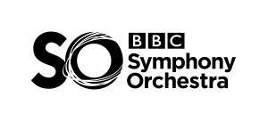
I have been smuggled the new logo of the BBC Symphony Orchestra by some of its unlicensed dissidents. See what you think.
The press service of the Mariinsky Theater has…
The Doric String Quartet, on the road since…
From the general manager’s self-admiring Sunday sermon in…

The Teatro Colón in Buenos Aires has appointed…
Session expired
Please log in again. The login page will open in a new tab. After logging in you can close it and return to this page.
Not that much of a secret, given that the BBCSO themselves tweeted a picture of it on 12 January!! https://twitter.com/BBCSymphonyOrch/status/162217927867768832/photo/1
Well, sorry but that was pretttty bland.
Both expected and very (too) middle-of-the-road. Even for the BBC.
However, they are in great company with this piece.
Greetings from OPUS and Sweden.
I’d like the money they paid to the graphic design “branding” consultant to come up with this.
Worse than the logo, although it’s terrible, is the reams of words that will surely be used to describe it:
“The graceful, elegant use of Baloney Sans Serif in the S illustrates the motion inherent in the ebb and flow of great works of symphonic music.
“Not coincidentally, it also stands for Symphony. The tightly kerned Baloney Sans Serif O and S are also highlighted by reversed lines which express the ‘moto perpetuo’ movement of the tip end of conductors’ batons as they punctuate the atmosphere of a grand symphony hall and produce ethereal sounds that mesmerize audience members and transports them to O ther lands and O ther peoples.
“To instill a sense of tradition and solid musical and cultural values, the addition of the BBC’s time honored logo is placed in a subdominant and subservient position above the words, should the viewer STILL not ‘get it’: Symphony Orchestra.
“We anticipate an 18 month roll out of the new logo with a slow transition of the entire mark to its ultimate minimalist form, the letters S and O standing, proudly, alone, surrounding the BBC logo with the Orchestra’s O, reversed baton strokes.
“We appreciate the opportunity to [next word struck through] fleece serve you and we are certain that you will, as do we, think you got quite a bargain at the not-for-profit rate of 500,000 Euros due upon receipt.”
Sincerely,
Blather, Bunkum, and Bankit
Counsellors in Public Relations, Marketing, and Bafflegarb
ROFL. Which of the 3B’s are you??
The silent partner: BS
They beat you to it, Norman. It was on Facebook yesterday and on the side of the truck today.
Still, I thought it would be hard to do worse than the last logo. I didn’t reckon with them asking Graham Norton to design it.
The BBCSO has a brand problem because a lot of people (like me) sometimes get confused and call it the BBC Philharmonic. With five orchestras in London, it can be daunting to keep their names all straight. Maybe that big SO is an attempt to help people remember the BBCSO’s real name.
Round and round and a bit of a mess. Just like the orchestra’s artistic direction these days.
So?