
Musicians in uproar over orchestra’s AI image
NewsPlayers in the Queensland Symphony Orchestra are up in arms over the latest marketing campaign, which features the orchestra sitting in the audience seats behind two anorexic, possibly ambisexual young listeners up front.
The hall itself looks nothing like the QSO’s Brisbane home.
The slogan reads: Experience the Orchestra.
Our informant spoke to musicians last night after an outstanding Mahler 7th symphony with chief conductor Umberto Clerici. The players were furious. When they raised concern s with the new Marketing Director, they were told to ‘stay in their lane’ and it’s ‘no one elses job to market’.
One of the QSO patrons has posted: ‘What is this disgusting AI image that you are using to advertise? Do you not support actual artists?’
They have a point.
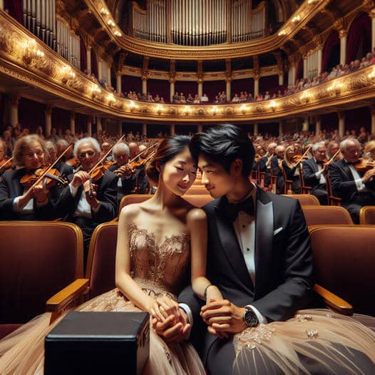
two people having a date at a indoor classical music romantic concert


What is it to be “ambisexual”?
So far as the image goes, they look to be engaged in something heterosexual.
Maybe because it looks like a sheer kind of skirt on the male .. it’s a confusing and unsettling picture for many reasons. I’m sure that was not the intention and it’s therefore unsuccessful as an ad.
The person in the black tuxedo is wearing something very strange in place of regular trousers. Has Australia also fallen, I wonder?
He has relieved her of her stole (note the same material and embellishments as her dress) and draped it over his legs.
Yes. I think the artist wanted to balance the color so there wouldn’t be a bright color on the left and just a black blob on the right.
There was no “artist”. It’s AI.
If ever I’ve seen a forced reading…. The image is deliberately AMBIvalent.
“Fallen” to what? Strange turn of phrase.
If you look closely you can see that he is wearing black trousers.
I am envious of the third violinist in, on the left side. He has enough fingers for the job, certainly. The 1st violinist in on the left has an incredible bow arm, the same one I would hope to teach to students. The lovers could be great for the Poulenc Double Piano Concerto. The marketing team might want to rethink the whole project…
Well it is a very weird picture. And feels like the sort of thing that someone who has never been to a concert might imagine. If they give no thought to how a concert works. Or how musicians play their instruments.
But I don’t understand your “ambisexual” comment. The two AI images at the front are very clearly representative of male and female asians. A bit stylised, but very obvious. That’s about the only bit they got right.
Anyway, perhaps the image was created in the hope of appealing to young adult Asian audiences going to their first concert, as a sort of socialite experience.
With that black box in the left foreground, it looks to me more like they’re listening to a concert on the radio and imagining themselves in a concert hall.
Leaving aside the ‘possibly ambisexual’ bit, a claim that would be interesting to understand what it is based on and, above all, why is emphasized…
The problem with AI generated pictures is the level of detail (it seems the AI is not so intelligent after all in depicting fingers): has anybody in the orchestra PR department noticed how the players are holding their instruments?
If the aim is to encourage people to experience a real orchestra, at least make the effort to use a realistic picture.
PS: what’s with the enormous box on the lady’s knees? An enormous engagement ring?
Does anybody even dress like that to go to a symphony concert?
Apparently, “Crazy Rich Asians” do.
As the old computer programing saying goes, “Garbage in, garbage out.” They must be using the same AI process as the one that spat out a black man in a powdered wig and military uniform when asked to generate pictures of the founding fathers of the United States.
By the looks of it, it’s disappeared from the internet now.
I would be slightly more forgiving if it was a decent image, but this is absolutely atrocious. Poor concept, dreadful execution (obviously Dall•e 3, rather than a more sophisticated image generator like Midjourney), and perpetuating awful stereotypes about classical music and the makeup of orchestras.
For the purpose of setting out my credentials, I am a marketing director working at a top-flight classical music organisation and a postgraduate lecturer in marketing. This is 100% my lane, and the only correct response is a complete and full apology to the players.
Totally agree. This also takes work away from skilled graphic designers and digital artists who could have crafted a far superior image that actually meets the brief.
(Nick?)
An apology for what?
Misrepresenting the orchestra as old and entirely white? Using such a crude and inaccurate image that cheapens the orchestra?
This could have been easily achieved by inviting the orchestra to take part in a photoshoot with a couple of actors. This isn’t a publicity stunt (nice try, those trying to sell that line), it is an experiment that never should have made it past quality control.
(@Fiona – not Nick)
Incorrect image – the country is only 17.4% Asian.
I wouldn’t be surprised if Asian-Australians are disproportionately represented in the country’s audiences for orchestral concerts.
I didn’t realize it was that high!!
Yes, but think – the best-known Australians on YouTube are probably twoset violin.
The music is ultimate promotional element. This is the work of an administrator who is not musically aware enough to trust the power of the music. We have surrendered our musical institutions to non musical administrators who have letters of credit after their names that are meaningless.
I’m rather concerned about the lady with the large black box….. her right hand is very deformed. As for the female violinist on the front left of the picture her bow is actually part of her body!
The infuriated musician who has informed the industry about this harmless little marketing strategy has done his colleague the Marketing Director a big, fat favour. There’s no such thing as bad publicity, and the manufactured indignation has generated tons. Respect.
Yeah. I don’t get all the outrage. It’s just a cutesy-ish little promotional piece.
Maybe the outrage was a ploy to attract attention. In which case, we’ve all been played (or is it ployed).
Now I feel used.
More respect.
No favour, really. This kind of attention in circles such as this won’t sell a single ticket, which is ultimately the marketing director’s KPI.
Well, it’s a little insipid but I see where they’re coming from. The musicians surrounding the couple make it seems like they are immersing themselves in the romantic atmosphere of music. It’s also marketed to young Asians, who are classical music’s best demographic besides the rapidly declining elderly white people. Makes sense, riiight?
Does to me. It’s no big deal.
For once the comment section is civil and all in agreement (myself included). I can’t be happier to see the readers of slippedisc united 😀
It is insulting to the members of the orchestra. These are accomplished professionals. This image portrays them as dead wood, with atrocious posture and absurd hand positions. I notice there’s no armrest between the supposedly glamorous couple, but the players are all tucked in tightly, right arms stuck to their sides. Somebody went to some trouble to come up with this design. Unfortunately, it’s completely unrealistic and extremely disrespectful.
Another bad attempt to ‘sell’ classical to a younger audience
Wonder if it worked and ticket sales went up?
They are not “anorexic”, they are normal size Asians.
Except their hands and fingers, what the hell is going on there?
It’s trashy artwork, and using their faces is a violation of their rights. That marketing person needs to be fired.
They’re not real people hahaha
Mahler 7 is hardly a romantic night out….
The lady looks as though she is attempting to grow facial hair…mm.
The image is another example that AI generated trash is more trashy than regular trash.
This is exactly what uncultured effluencers would imagine what a classical music concert would look like. The music is secondary, as long as I/me/myself takes front and center stage for a perfect Instagram/Titok shot. A Lang Lang moment.
I love this stuff! It’s exactly how I imagined a classical music concert to be before I actually went to one. (That was quite a disappointment, there were no asian guys holding my hand.)
Sally
I think the black box might be a Deliveroo consignment. Something hot and steamy for the interval? 🙂
Did she just come out of a concentration camp?
Please don’t say concentration camp. The Chinese Communist Party and their supporters prefer to call it “vocational training center.”
What’s “ambisexual” about them?
It’s an interesting concept, and that’s what AI can do best: occasionally assist in helping us think outside the box. So, why not pose a real couple and the real orchestra in their actual venue and take a photo? PS: the marketers need to listen to the orchestra members!
They are musicians, not in marketing. Marketing people don’t tell musicians how to play so why do musicians feel they can tell marketing people how to market?
“Know your product” is Rule 1.
The image is awful, but the management telling players to “stay in your lane” is atrocious. Key management principle: Listen to your people.
I don’t get what’s offensive about it.
What is everybody getting so worked up about? What is disgusting about the image? Perhaps there is something disgusting in the minds of people disgusted by it.
It is an obvious allusion to Japanese anime. One would hope that classical musicians have at least heard of Joe Hisaishi?
I have seen every single Ghibli movie and fail to see the allusion. I’m also Asian and it’s a bit of a stretch to assume the couple’s racial identity from the picture.
I didn’t mean a specific allusion, but I don’t think the image would be out of place in a Studio Ghibli movie.
For me, the only thing “disgusting” about this is the execution of the concept. It wouldn’t have been demanding to photograph the young couple for real. If they couldn’t afford models, an alternative concept should have been chosen, rather than make something this cheap and tacky looking.
The picture shows what AI thinks how classical music picnicks in China take place.
Good taste looks like to be dead…
Why is the orchestra sitting in the auditorium? And why are the couple facing away from the orchestra?? So many questions, so many puzzles about this picture???
Where’s the ad? I haven’t been able to find it.
Oh ran on our Facebook page as a sponsored ad for 24 hours.
I’m outraged by the racist AI bot making those squinty eyes.
The only place this image appears is on this website. Fake news. I get all over QSOs emails/posts and haven’t seen this anywhere. Maybe check your sources. And anyone who has shared this without checking if its true, shame on you.
This was a sponsored ad – they don’t show up on our Facebook page and was only running for about 24 hours before our Mahler performance. Real news.
If the musicians in the ad get to leave their lane (the stage) and sit in the audience seats, then the real musicians get to leave their lane and critique the terrible artwork.
That looks horrible- the AI images look like anorexic wooden dolls with weird banana fingers. Considering how cheap smartphone images are and how good many artists and orchestra staff are at taking photos, could they not just have asked volunteers from audience or staff to pose as audience members? It would be cheaper, look less creepy and less insulting.
They also don’t need to be depicted wearing such posh clothing- are many (any??) QSO audience members on dates who dress to the nines like they’re attending a posh wedding?? It’s ignorant on so many levels and hilarious for the wrong reasons.