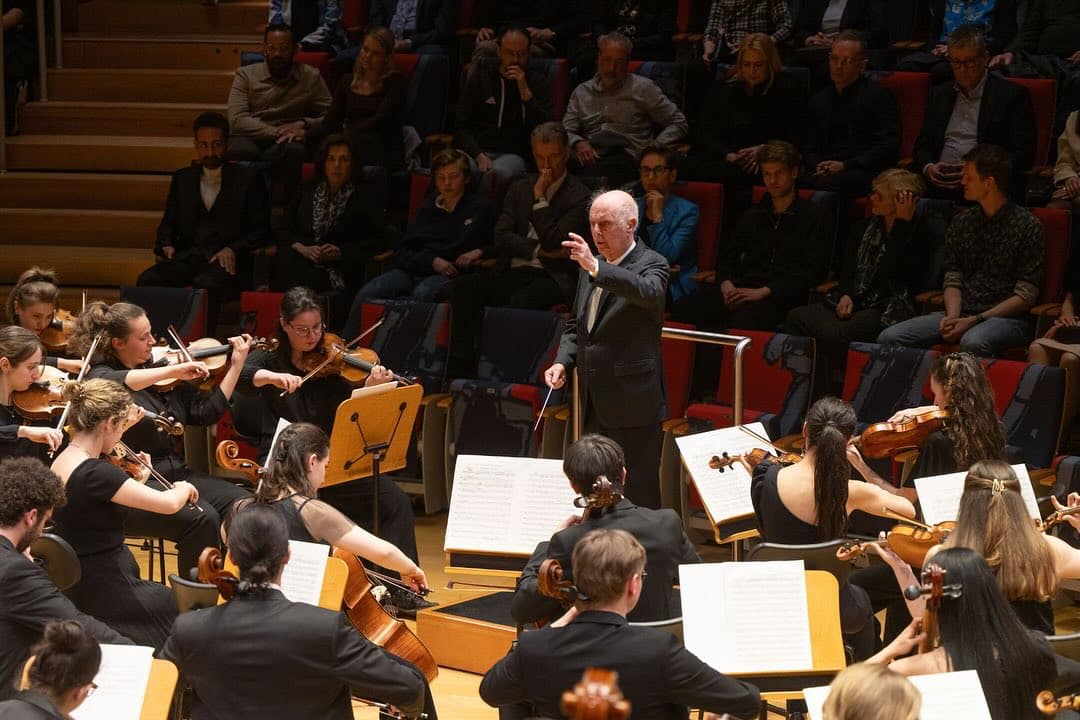
Meet Simon Rattle’s new designers
mainThe Partners has designed the visual identity for the London Symphony Orchestra’s (LSO) 2017/18 season, to coincide with conductor Sir Simon Rattle becoming its music director in September this year.
Inspired by the consultancy’s original identity for the orchestra, which features a logo representing a conductor, the new identity depicts the conductor’s movements and is designed to reflect “the emotional power of music through colour, texture and motion…”
Read on here.
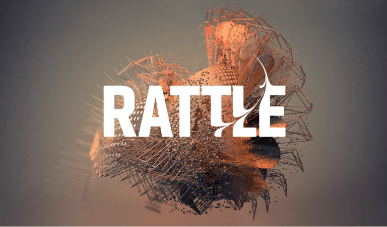
And this is the designer-made video.

On paper, it must have been a nice idea.
Or they could have saved the money spent on this and used Windows Media Player from early 2000s, it did the same thing for free.
Meaningless. A decidedly better idea would be to watch an orchestral performance on YouTube. There’s one upload of Vernon ‘Tod’ Handley conducting Elgar’s First Symphony in Melbourne. One of the best directed I’ve seen, a wondrous performance, and everyone, though music students notably, could learn immensely about conducting from watching/listening the that video.
Looks like it’s all unravelling already. Sorry, can’t bring myself to watch the film. Tumbleweed…
I once was the subject of a similar conductor representative graphic design by a Hungarian team, however, they made an exact digital representation of what each hand was doing based on a youtube video. You can compare their work here:
https://www.behance.net/gallery/4726035/The-Conductors-Gestures
Looks like – in sequence – an accordion, the new London concert hall crashing down before plans are approved, a couple of fireflies, the birth of stars taken from the Hubble telescope and some sort of bird flapping its wings. Moving? Visually – 100%. Inspirationally – 25%. Emotionally – 0%
Isn’t it great? Bravo, The Partners!
I thought it was Trump’s wig/hair.
Good grief, what negativity!