
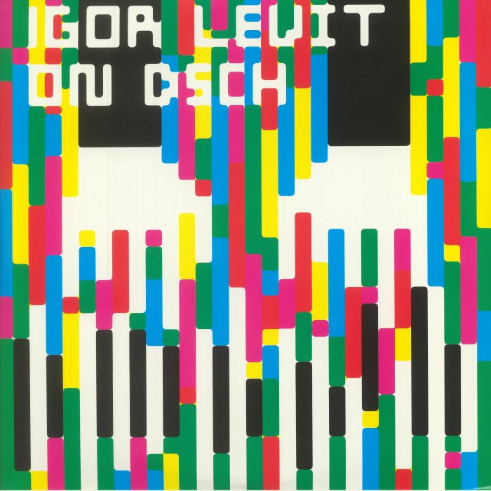
Levit out? Possibly the worst album promo of the year
mainHere’s what those smart folks at Sony have come up with.
Not sure if the psychedelic colour scheme disrupts the music or vice-versa.

Here’s what those smart folks at Sony have come up with.
Not sure if the psychedelic colour scheme disrupts the music or vice-versa.
The Mozart concerto due to be played three…
The Manhattan School of Music this morning quietly…

The tenor Ian Bostridge shocked Symphony Hall Birmingham…

The orchestra’s president Gary Ginstling has engaged Katya…

Session expired
Please log in again. The login page will open in a new tab. After logging in you can close it and return to this page.
well it does grab your attention…
Now I wouldn’t be surprised if this is his last for Sony. (and then he switches to DG?)
The picture is reminiscent of those TV test screens that appear after the show is over. (some of us should be old enough to remember the days when tv programs ended at some point and the test screens came on)
Slightly misleading title “Possibly the worst album promo of the year”. More ‘accurately’ would be “Possibly the worst piano player of the year with an appropriate promo”.
That’s what my field of vision looks like when I’m having a migraine! The last thing I want to hear when I’m in the middle of an attack is the percussive tinkling of a piano!
I bet the album’s good, though!
Repulsive hype. Just like him. Actually, it fits perfectly.
That presupposes that classical music fans actually like the standard album cover of a bad head shot of some pasty faced unsmiling musician sitting at or otherwise holding their instrument staring blankly out at us.
Here’s a little industry secret: they are ALL bad covers.
Perhaps another industry secret would be that many of us really don’t care all that much about the cover. I certainly don’t. It could look like a marc record in an old card catalogue. At least then we would be guaranteed useful info on the cover. I saw this set recently and heard excerpts. I was especially happy that he had taken on the Stevenson. I don’t take seriously his attempts at self promotion. They are simply too obvious, like a caricature. Some find it annoying, but there will always be musicians who are full of themselves on a personal level, but whose work I appreciate nonetheless.
This is the article everyone should read about Igor PogorLevit: https://van-magazine.com/mag/igor-levit/
It might be the picture of something he ate ‘against Right’ and then vomited.
Not that the music was ever up to much anyway !.
If this blog were the arbiter of style, people would still be wearing powered wigs.
One is grateful its not the case.
“Powered wigs”, eh? Did they have little casks of whale oil to power them, back in the day?
The concept is fine but a very lame execution indeed. Looks like the budget was a pint of lager, a packet of crisps and half an hour in post-production on some guy’s bedroom Mac. I would have been embarassed to be associated with it – does DG not realise shoddy visual work reflects poorly on them? Or maybe they thought it was great …
Sorry – should have read Sony of course, LOL …
This looks like a cheap knock-off of Saul Bass’s art work for the Frank Sinatra album Tone Poems of Color.
https://en.wikipedia.org/wiki/Frank_Sinatra_Conducts_Tone_Poems_of_Color
Something reminiscent of wind chimes
I find it very interesting- rather ridiculous- that people who could try their whole life to reach the musical level of world class artists like Igor Levit, but never would reach just a little bit of his level, criticize his playing. He is Sony Classical artists since many years, but some write about a DG cover, which means they don’t know about his work at all. Igor Levit is a very fine musician and a very fine person, too, surely by far finer than some who comment on this platform.
The content of the album is intriguing, however: pairing the DSCH Preludes and Fugues with the Stevenson Passacaglia on DSCH is inspired, and it has been a long time since the last recording of the latter.
Anyone prone to epileptic seizures could have an episode when seeing that monstrosity. Mind you, it suits the arrogant, attention-seeking pianist.
I love it! I absolutely object that it would be the worst promo. It’s a great one. Its square format suggests it was made for Instagram, a platform for younger audience, who scroll it on hyper-speed. If the visuals are not attractive enough they’ll not stop for a single moment. This way they at least stop and are exposed to the music. Well done Sony, more like this would be welcome.