
Our new sponsor’s an optometrist
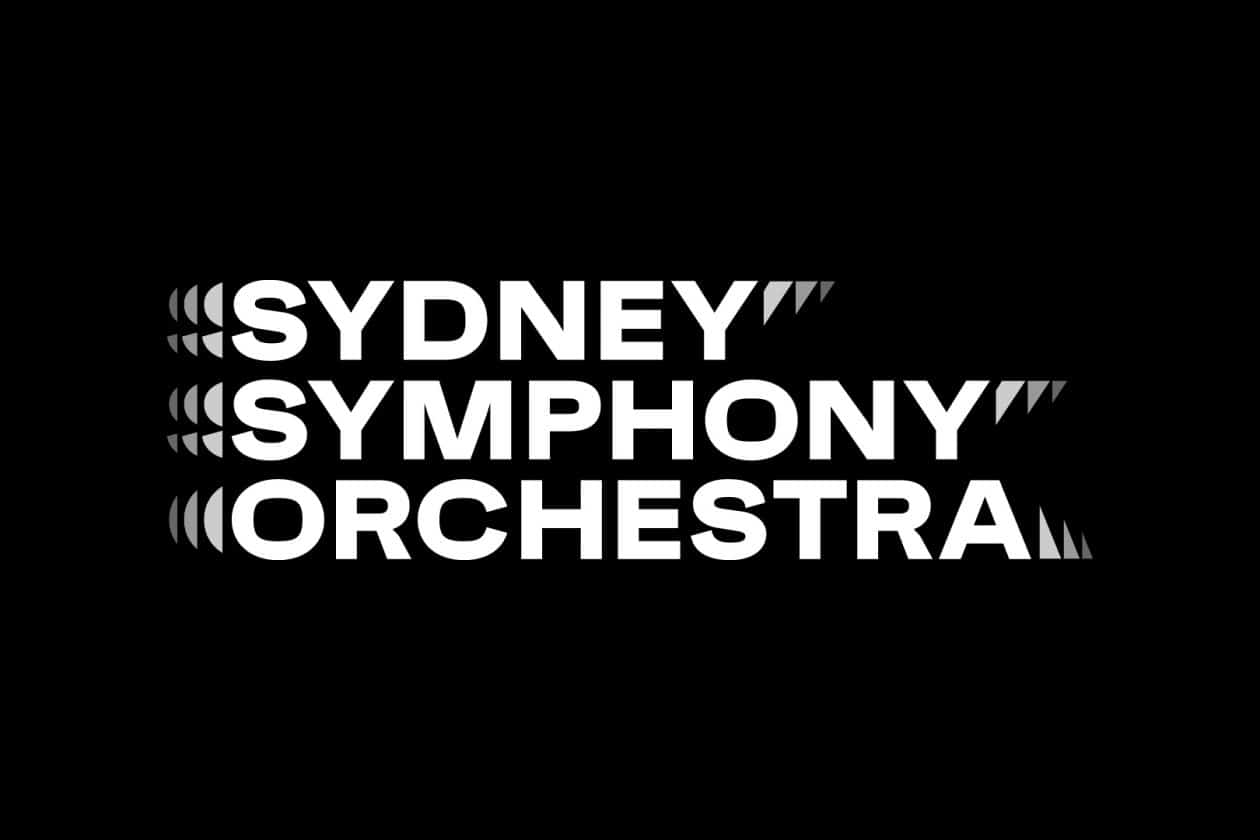
mainDuring lockdown, the Sydney Symphony rebranded.
Sydney Symphony Orchestra Director of Marketing Luke Nestorowicz said: “We’re excited to present the latest iteration of the Sydney Symphony Orchestra, casting classical music in a fresh 21st Century light. This is a bold step in the Sydney Symphony Orchestra’s almost 90-year history and a reimagination of classical music in a contemporary context.”
Really?

As boring and uninspired as the upcoming season programming, sadly.
Sounds like this man has no idea what he is marketing. He has nothing to reimagine. Separately the graphic idea is poorly executed: the echo effects on the left and right are out of balance and the typography is weak. Consider the absence of ligatures, the failure to correct the negative space around the 4 Ys, and left of the A, and the font’s lack of distinction.
Specsavers??
Agreed, the logo looks something like a beginner graphic designer could whip up for a first assignment. Not memorable with no link whatsoever to what an orchestra is or does. What Luke Nestorowicz is going for isn’t doing any favours for this orchestra…
Yes, the “look & feel” of this logo is more like what we’d see on an Eighth Avenue porno establishment in New York City.